


A one-function, point-and-click Shiny interface for the descriptive analysis.
ggstratify(your_data)That is the only function you need to remember.
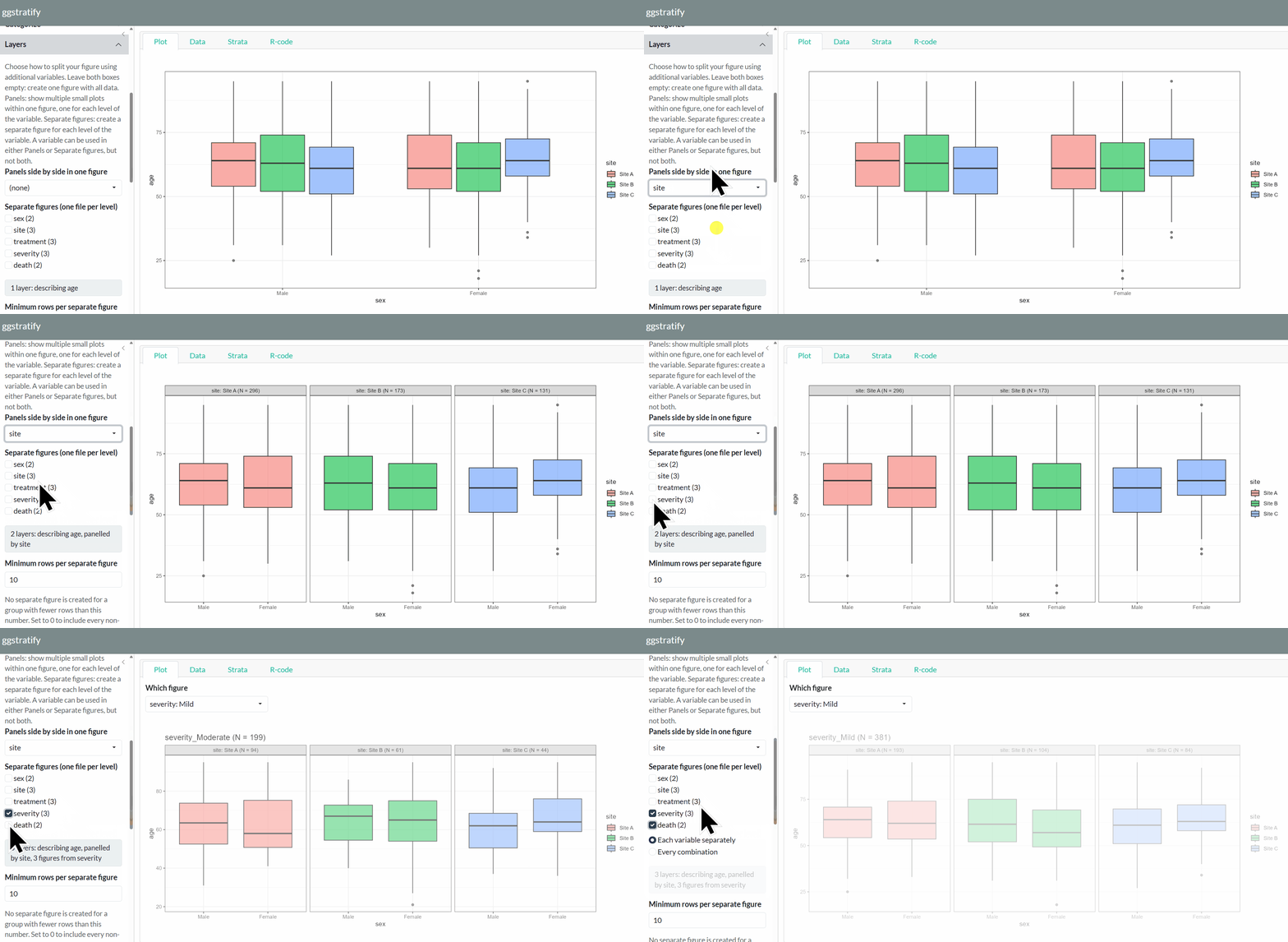
Descriptive analysis is essential in every research study. Humans (not AI) need to understand the data before making decisions, such as choosing an appropriate statistical model.
In particular, understanding how variables are distributed across strata defined by other variables is often critical.
Visually inspect your data without repeatedly writing code.
ggstratify runs entirely locally and requires
neither a network connection nor a language model.
Easily export figures to share with collaborators.
This package describes what it is given. It does not guess what you meant. Convert each column to the type you intend before handing it over.
dat <- transform(
  dat,
  sex       = factor(sex, levels = c("Male", "Female")),   # groups as factors
  severity  = factor(severity, levels = c("Mild", "Moderate", "Severe")),
  age       = as.numeric(age)                              # measurements as numeric
)
ggstratify(dat)
A grouping variable left as 1, 2, 3 will be described as
a number. The order of a factor’s levels becomes the
order of the panels, the figures and the axis.
From CRAN:
install.packages("ggstratify")The development version from GitHub:
# install.packages("remotes")
remotes::install_github("AkiShiroshita/ggstratify")library(ggstratify)
ggstratify(epi_cohort) # the example data that ships with the package
ggstratify(iris) # data.frame / tibble / data.table / matrix| Tab | Contents |
|---|---|
| Plot | Either every figure at once as panels (fastest) or one at a time, enlarged. The variables you chose decide which (see below) |
| Data | The first 200 rows |
| Strata | Every stratum: variable, level, N and the file name it will be written to. Strata with no file name get no figure. Plus the rows excluded for missing values |
| R-code | The ggplot2 code for the figure on screen. One button
copies it |
Boxplot / Density /
Dot + Error / Dotplot / Histogram
/ Kaplan-Meier curve / Line /
Scatter / Violin
On a Dot + Error figure, Join the dots with a line under Plot options joins the points left to right – one line per colour and per panel – which is what a set of yearly estimates is usually read for. The line is computed by the same summary as the dots, so it passes through them.
Derive a variable makes a new variable out of one you already have, which can then be used as a layer like any other. A continuous variable becomes quantile groups, equal-width bins or your own cut points. A variable of any type becomes missing vs observed: the rows where it has a value and the rows where it does not.
A date or date-time variable gets a time resolution. Either a calendar period – the year, quarter, month, week, day, hour or minute it falls in, which keeps it a date and so keeps a trend spaced by elapsed time – or a position in the cycle, which drops the year and pools every March since the data began: month of the year, season, quarter of the year, day of the week, hour of the day. Months run January to December and days Monday to Sunday, never alphabetically; the season’s start month is yours to choose, so March gives the northern hemisphere and September the southern.
For a Line plot drawn against a date, the
Appearance panel sets how far apart the ticks are and
what each one reads, so a column of dates can be shown and labelled as
years.
crp in the bundled epi_cohort is incomplete
on purpose and admit_date spans three calendar years, so
ggstratify(epi_cohort) is enough to try both.
Set a numeric column as the Survey weight under
Describe, and each row counts for as many people as its
weight – aes(weight = survey_weight) for a histogram,
density, boxplot or violin, and a weighted fit for a smoother. Every N
is shown twice, as rows and as the sum of the weights. The bar on a
Dot + Error figure and the band on a Kaplan-Meier curve
are design-based estimates from the survey package,
with the sampling strata and clusters
as well when you give them. The design is the whole sample’s, and every
panel and figure is a subpopulation of it. svy_weight in
epi_cohort is there to try it on.
GPL-3